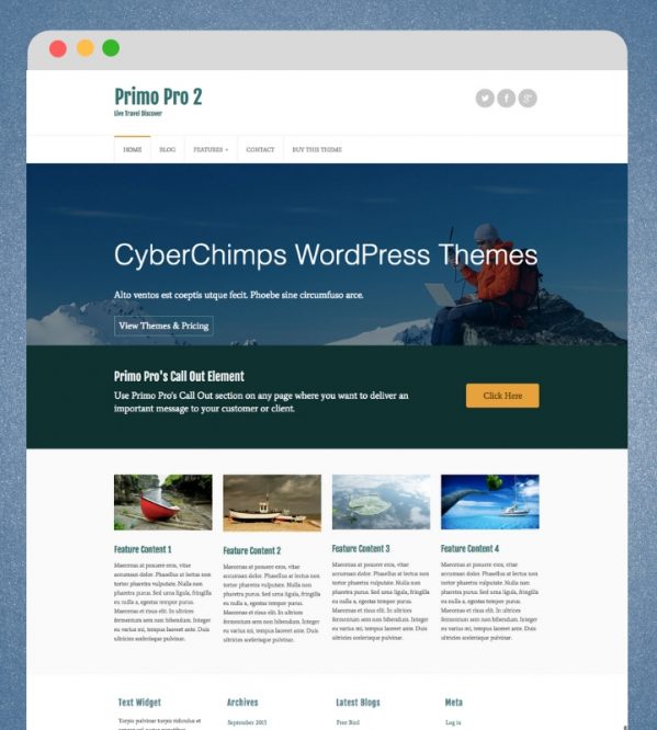
Let’s start with WordPress.
Picking the right theme for your website is an essential part of your success. It is best to pick a theme that works well with your site, and also that you feel comfortable with. What works well for a business site may not work the best for a blog.
Today, we will discuss three different themes from CyberChimps- one for e-commerce, one for business, and a blog themed one. For each theme, we will go over the strengths of each one, as well as what key features they each have. I will also provide steps for you to follow on how to step up your homepage, add a footer, and much more.

Before we delve into each theme, I will briefly talk about CyberChimps, the company that each of these themes is from. To date, they have over 60 themes and plug-ins, with over 158,000 users. They have many different kinds of themes, from free ones to magazine themes. They offer one-page themes, multipurpose themes, and WooCommerce themes. CyberChimps takes pride in serving their customers, as they believe you should get help when you need it. This company also believes in designing premium products that work and giving back to the WordPress community.
Eldekor: A theme for E-commerce
Eldekor is a theme that works with WordPress and was designed by CyberChimps. This theme is perfect for any type of store. You can showcase your trending products, but there is also a category section. In this category section, your users will find it easier to locate what they are looking for.
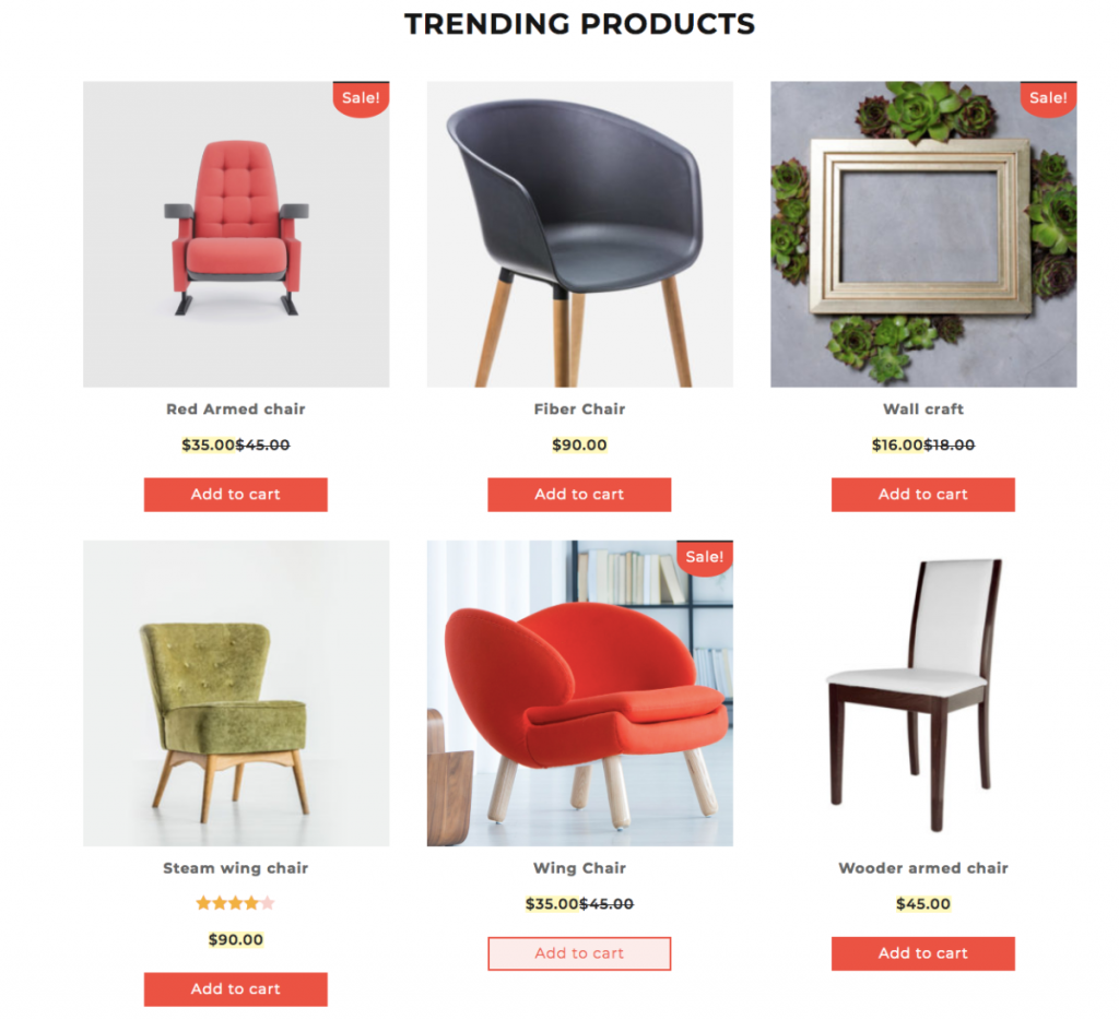
Key features of Eldekor
Eldekor has many key features that make it perfect for using it for E-commerce. Such features include:
- Responsive across devices- Any device you use this theme on will look great and be fully responsive. This includes your tablet, smartphone, desktops, and laptops. It works quite well with wide devices as well.
- Custom fonts, logos, and colors- With Eldekor, you are able to use custom colors. Support will help with a custom font, as well as a logo and layouts of your sidebar.
- Typography that looks great- Eldekor allows you to create blog posts that are easy on the eyes. The look is classy and business like.
Strengths of Eldekor
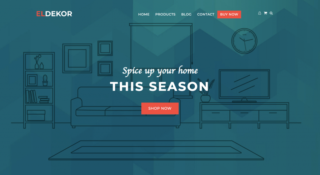
One of the biggest strengths I have found with this premium theme is that it comes with a banner section that is perfect for highlighting any brand’s features. This makes it very easy to add a call to action button to direct your customers there.
I also appreciate that it comes with the homepage, category pages, store pages, and a blog. And the review section makes it great for your customers to see what other customers are saying about your brand.
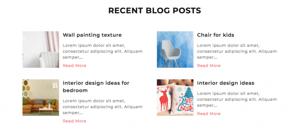
I really love how easy it is to set up categories so your store will be easily accessible to your customers. When things are easy to locate, you will have a much higher chance of selling an item to interested individuals.
I have found that Eldekor is a great theme to use for any E-commerce site. It is very easy to set up and includes all you need to get your store up and running. You will receive free updates for life, along with a 30-day money back guarantee. Once you purchase this theme, you will be able to use it on unlimited websites. Eldekor is clean cut and simple, and very pleasing for the eyes to look at.
SuperStructure: A theme for business
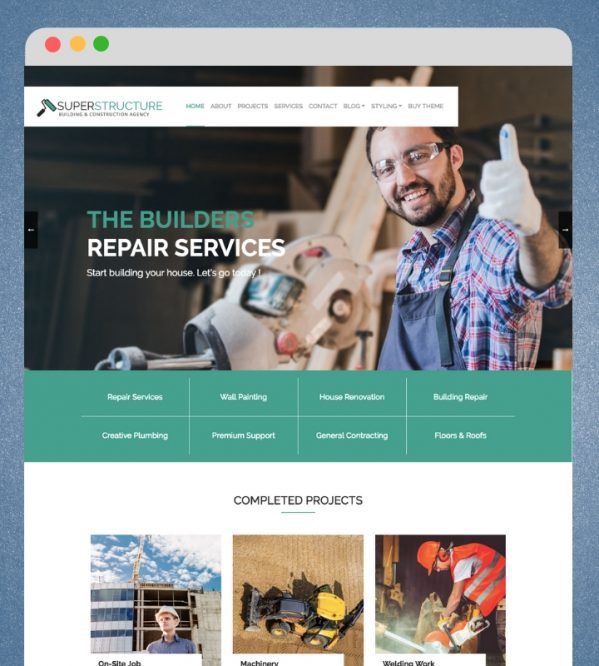
SuperStructure is a clean theme that is great for those looking to build a website for a company. It has a very professional look, which will make your site look like you spent more time designing the site then you did!
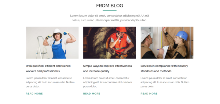
Key features of SuperStructure
There are many key features that make SuperStructure great to use. These include:
- Fully responsive website- SuperStructure allows the website to look great on tablets, smartphones, desktops, and more!
- Typography that stands out- No worrying about pages that are not easy to read with SuperStructure.
- Custom logos, fonts, and colors- Use these to suit your needs for a fully customized look.
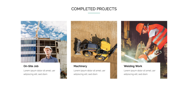
Strengths of SuperStructure
I have found that one of the biggest strengths of SuperStructure is that it comes with a pre-designed homepage. The homepage showcases the hero banner area that has a slider. It will show testimonials, a project section, a recent post section, and a footer section. I like the clean design and how it all flows together.
Something else that anyone who has a business will like is testimonials. SuperStructure allows easy set up of a testimonials page, so people will see what your real customers are saying about you and your brand. I find that having a testimonials page is a very useful tool for your business.

I appreciate that SuperStructure is very easy to set up using the pre-designed homepage. CyberChimps have made it super easy to edit as well. To edit your homepage, follow these steps:
- In the WordPress dashboard, go to Pages → All Pages.
- Select SuperStructure homepage.
- Select Edit with Elementor.
You will be able to now edit each section, and also change the sequence of the page if you desire.

It is also simple to add slides to your homepage. To do so, follow these instructions:
- Go to Slider → Add New in the WordPress dashboard.
- Add the title of the slide, the description, and the featured image.
- Tap on the publish button
It is also useful to add a footer to your page. Here you can add your contact information, direct links to your blogs, and more. To add this footer, follow these steps.
- Go to appearance → widgets in your WordPress dashboard.
- Here you can add, remove, or update the widgets.
If you are interested in editing the About page, follow these simple steps:
- Go to Pages → All Pages in your WordPress dashboard.
- Edit the page.
- Then click on the edit with Elementor button.
Primo Pro2: A theme for blogs
If you are looking for a business themes, CyberChimps can help with their Primo Pro 2 theme. This amazing theme has so many features that it is hard to pass it up.
Key features of Primo Pro2
Many key features make Primo Pro2 exceptional. These features include:
- Many sidebars- Highlight your website using a variety of different sidebars.
- Header images- A header that has a CTA button and a caption. This is an amazing marketing technique to draw in your customers.
- Call out elements- Showcase all your website’s important information.
- Portfolio elements- Modal effects can easily be added to your website using this feature.
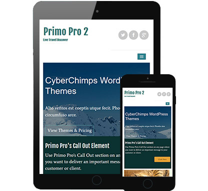
Strengths of Primo Pro2
I have found there are so many strengths to using Primo Pro2. First off, I love the fact that it is a drop and drag page builder. I really do not think that you can get any more simple than that! Dropping and dragging is easy for anyone to do, even if you do not have much experience.
And who can forget about touch optimized sliders and banners? This is such a great strength because it screams easy set up! I also appreciate the 4 amazing designed skins and the multilevel drop down menus.
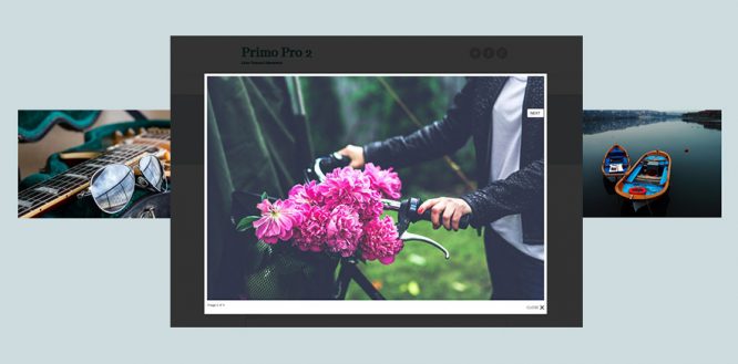
I personally love the entire look of Primo Pro2. I find that images look elegant with this theme. A page can look very well put together when using this theme. It is very user-friendly and truly does offer a complete package for all your blogging needs.
Template options are something that I think many, including me, like in a theme. Primo Pro2 will give you sidebar layouts for all pages. This includes a 404 page, the search page, a single post page, blog pages, and archive pages.
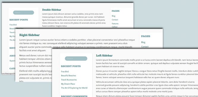
Primo Pro 2 has lifetime access when you purchase it. There are never any renewals, and it comes with a 30-day money-back guarantee. You will be able to use it on as many websites as you desire. It is feature-rich, as it is translation ready, SEO optimized, has Google web fonts, and has easy integration with social media profiles.
The Pros of Using Pre-Built Themes
I have found many pros with using pre-built themes. These include:
- They are usually cheaper than building your own. And much faster!
- There is no coding involved. This makes it very easy to get a website set up.
- Updates are typically sent out for those that have purchased a theme.
- CyberChimps makes sure security is top notch. They take special care when themes are used for businesses, software, and many others.
Now, let’s move on to our top Shopify theme.
Grid Shopify Theme
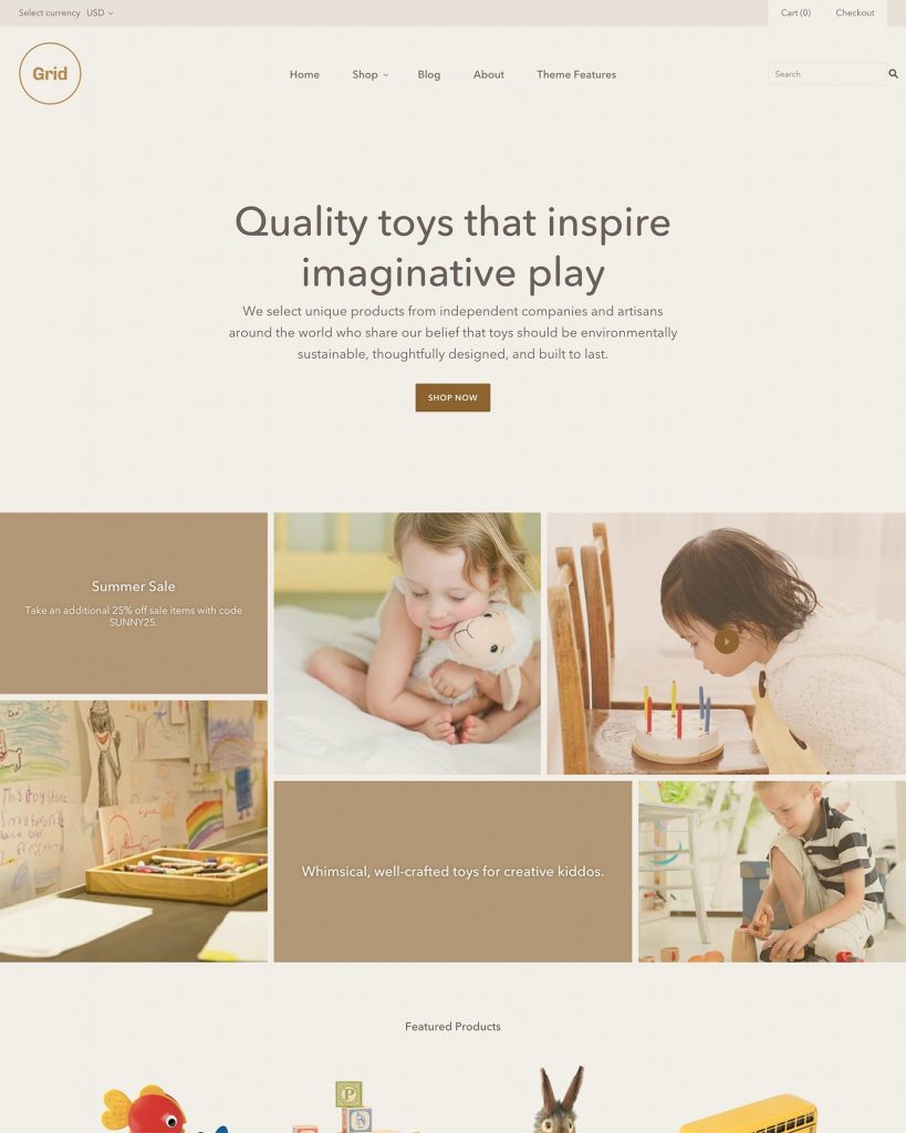
Grid is a Shopify theme that has a very modern look. It was designed by Pixel Union, which is located in Victoria, Canada. It has a very distinct look to it and is perfect for those looking for something that has powerful navigation while being easy to use and update. It has frequent updates, so you know that you are getting the best theme you can for your money.
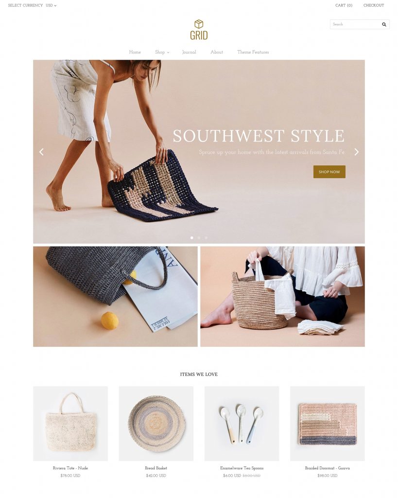
Grid has four different styles: Bright, Light, Moody, and Warm.
The Bright style is featured above in the image. This style is warm and friendly with neutral tones. The background color is white, and the buttons are a golden brown color. It is very easy on the eyes.
The light grid theme is simple with a white background. A very light gray can also be seen when the page is divided up. This is an elegant design that would work well with many different types of websites. Below is an image of the Light theme.
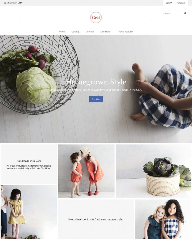
The Moody theme features grays. This theme is perfect for those who like darker colors but still maintain elegance. The gray colors used really set off the products and can make them look even more appealing to potential customers. The Moody theme is featured below.
Warm is the last theme for Grid. This choice features neutral browns in various shades. Great for those that want some color but not much to overpower the website. The warm theme is featured below.
Features of the Grid theme
The Grid theme has many great features.
- Optimized for large catalogs- This theme was built for those that have large collections or numerous products for sale.
- Quick shop- Customers are able to have a faster checkout experience with a streamlined add to cart popup.
- Multi-column menu- Products can be featured in large, multi-column drop-down menus.
- Unique Masonry Grid- Showcase your products and videos with little effort in this elegant masonry grid.
- Masonry and standard layouts- Products, promotions, and posts can all be showcased with either layout.
- Multiple product page layouts- Create the best shopping experience for your customers with multiple product page layouts.
Starting with Grid
If you purchased your Grid theme right from Shopify, you will see it is automatically installed once you log into your Shopify admin. If you purchased the theme from Pixelunion, you will get a ZIP file to download your theme. Once it has been downloaded, you will go to your Shopify dashboard, going to Online stores >Themes. Here you will upload your Grid theme by clicking on Choose File from your computer. Then you will click on Upload. A new theme will show up below the old theme. It will be installed fully, but not published. This will allow you to work on the page. Once you are completely finished, you can click on the Actions menu and then select Publish.
Product Pages
You can use your product page to highlight products that you have. It can contain the product title, images, price, description, and an add to cart button. It is easy to customize your product pages in the theme editor from the drop down bar. You may also click on Product Pages under the selections tab.
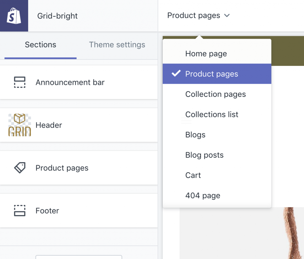
For your settings, you will need to check the corresponding box if you want to show the vendor name or not. You will also have the opportunity to check the Show Social Media Icons. You will then be able to connect to those networks you wish in the Themes setting >Social Media.
There are three different options on how you can display your images:
- Slideshow- The main image will be shown with smaller thumbnails of other images. This is considered to be the standard image layout.
- List- Close to the slideshow, however, each image is full-sized. They are also displayed in a collage-like column.
- Masonry- These images will be displayed across the top of the screen.
If you want, you can enable the zoom feature by checking this option. If a visitor hovers over the image, a magnifying glass will appear. Once they click on that, it will show the product as a close-up. This option will only work when the slideshow option is used.
Masonry Images
As stated above, Grid uses Masonry images. If you are uncertain about what a good starting dimension might be, Grid recommends using 1400px X 640px. You should note that since responsive images are featured, any high-quality image can be added to the site. The right image size will automatically be displayed for the device a user is on. Using images with text or logos is not advised, as cropping may happen on certain screen sizes.
If you want to display more content, consider using landscaped oriented or square images. Portrait orientated pictures have the tendency to be cropped when added, which in turn will make the image smaller.
Adding Video Features in Grid
If you are interested in adding videos to this Shopify theme, you can do so by replacing the 6 pre-loaded image blocks. First, you will need to select the image block you would like to remove, then click on the Remove Content button on the bottom of the block. You may then select Add Content, then select Video Feature.
Enable Cart Redirection
Enable cart redirection gets your visitors to the cart page after they have clicked on the ATC (add to cart) button. The purchasing process is streamlined this way. You may need to disable the function of staying on the product page after the add to cart button is clicked. This typically happens when certain apps are added.

You can also use the Enable Dynamic Checkout button. This will allow your visitors the chance to go directly to the checkout page (the buy it now button). Here they will be able to add their type of payment and quickly complete their purchase.
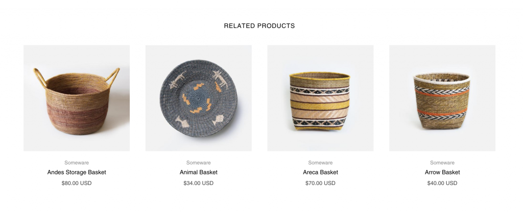
Related Products can also be used to help your visitors see other items of interest. These products will be pulled from the collection type they are associated with. If the product belongs in more than one collection, the first one to be pulled will be alphabetical.
Collection Pages
You can display all of your collections on the same page using this feature of Grid. Collection pages can be customized to your liking using the Collection Page in the dropdown. You can also go to the theme editor and click on the Collection Pages under the Sections tab.
There are two different layouts to the Collection pages: Default and Masonry. Uniform rows will be displayed when the default layout is used. An offset collage-style can be seen if Masonry is used. You will also be able to pick how many rows you desire to have, from 2 to 12. You can have 2, 3, or 4 items per row.
There are several settings that you can use in collection pages:
- Show collection image- Here you will be able to pull your collection image, which has been set in the Products >Collection Area of your Shopify admin.
- Show description- With this, you will be able to place a description on each collection page. Add in the collection admin under Products >Collections.
- Enable sorting- With this setting, you will be able to use custom tags to sort products. These can be added in the Shopfiy admin on the right hand side under Organization.
- Enable Tag Filtering- Here you will have the chance to sort products using tags. These can also be added on your Shopify admin under Organization. They can be found on the right hand side of the editing screen.
Payment Icons in the Footer
You can have payment icons in the footer with the Grid theme. To make sure you are able to see them, first make sure that all payment types are correctly set up in the Shopify admin under Settings >Payments. You will then make sure there is a check by the Show payment icon configuration. You can see this under Customize > Footer.
From there, you will need to compare your footer with the release notes. Icons may have been just added. You can find your version number by going to Customize, and then click on Theme settings. You should be able to see this on the bottom left of the left side bar. If you are not current with payment methods, you will simply have to add what is missing.
Grid Support
If you are still having trouble getting your Grid theme set up, you can contact their support team. They will respond back to you in a reasonable fashion, usually by the next business day. They are open from Sunday to Friday, except holidays from 8 AM to 6 PM PST. Their team will help you get the most out of your Grid theme. They also supply App articles and theme articles on their website, or you can look on Tumblr, WordPress, WebFlow, or Big Commerce to read more.
Conclusion
There are many different themes that one can pick for their website. Many great ones are geared for WordPress. Pixel Union is a great place to look for Shopify themes.
Today, I had the chance to share with you several really great themes that can be used for different purposes. Each theme has its own strengths and features that make it work well for different sites. I advise anyone looking for a theme to find something that they are comfortable with that is easy on your customer’s eyes. It is also wise to pick one that is fully responsive so anyone can access your site on their mobile devices.

